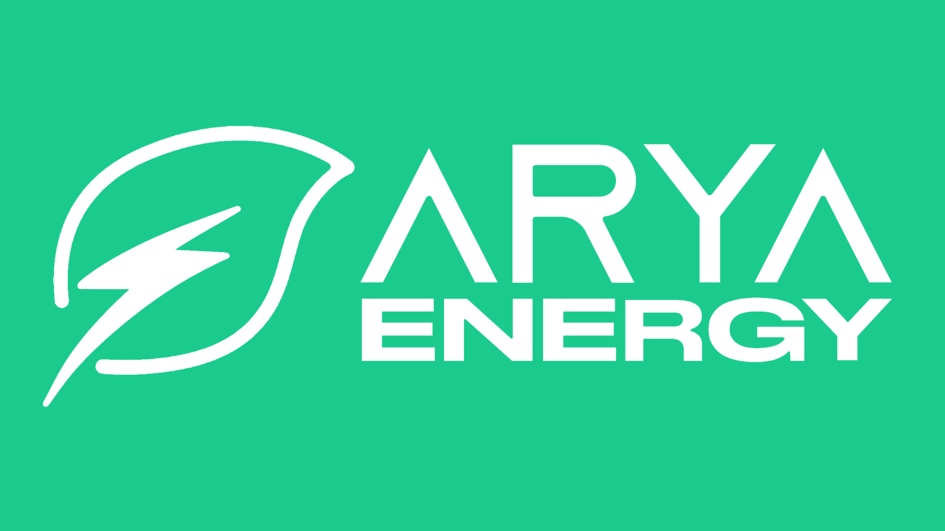
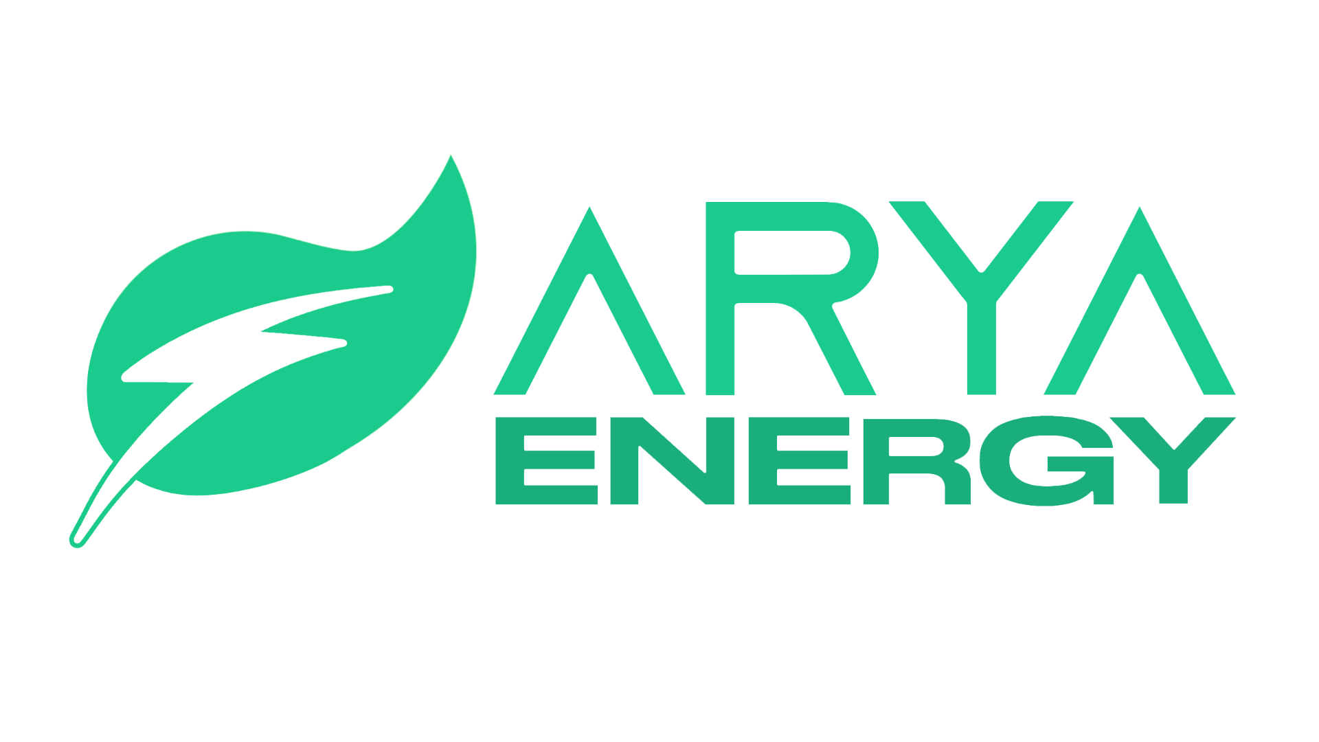
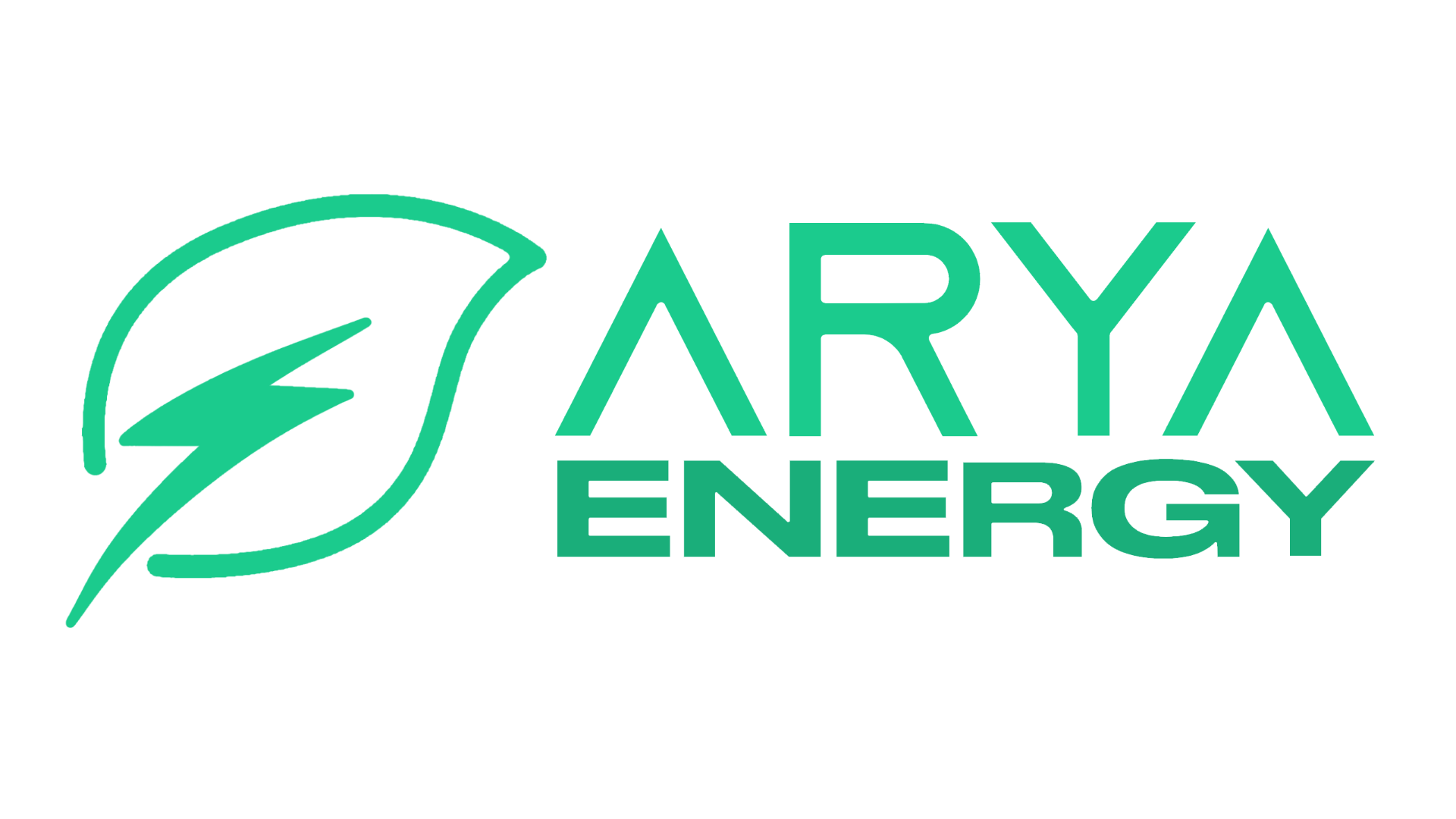
ARYA
ENERGY
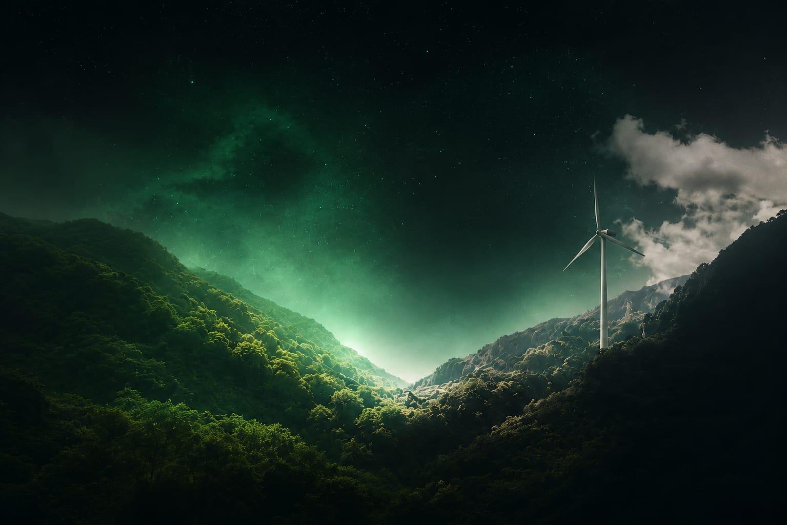
A modern, scalable brand identity designed for a clean-energy company focused on sustainability, innovation, and a better future for our planet.
ENERGY,
ENGINEERED
WITH CARE.
Arya needed to feel both organic and electric — a brand that reads as a living energy system, not a logo bolted to a sustainability campaign. Three pillars anchored every decision.
Visual cues drawn from organic forms — leaf, growth, renewal — coded into every touchpoint.
Bolt geometry signals kinetic energy and forward motion. Future-facing without being cold.
Geometric stability, balanced negative space, considered typography that reads as engineered care.
LOGO DEVELOPMENT
From symbol to system — four stages of formation.
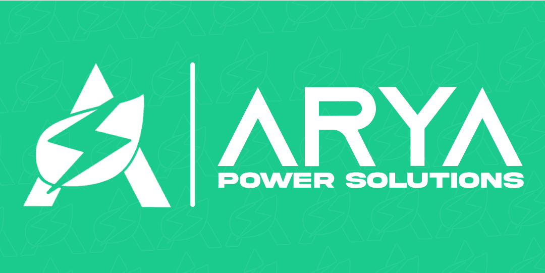
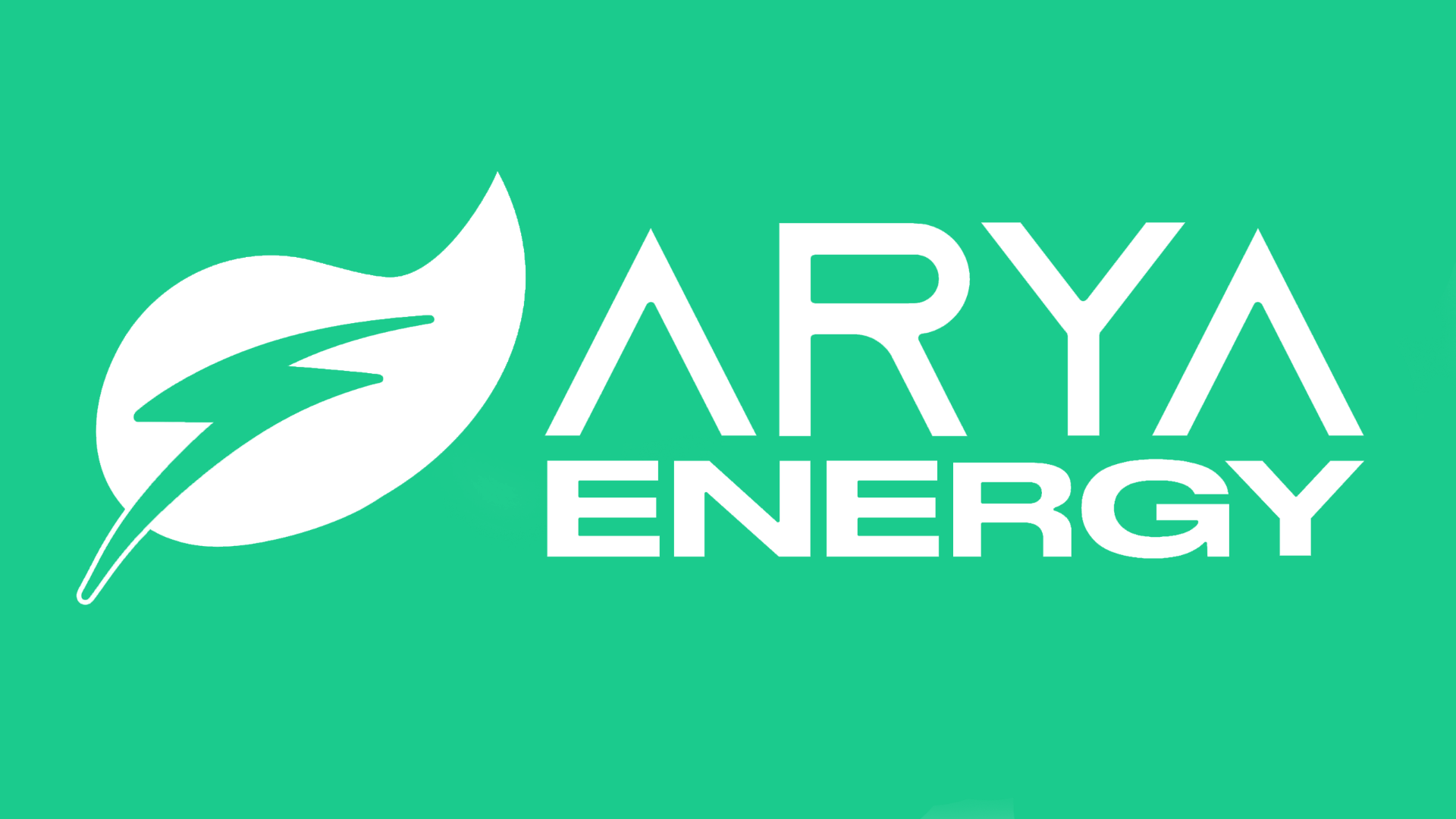
LOGO VARIATIONS
PRIMARY MARK · 6 STATES


HORIZONTAL LOGO
VARIATIONS
COLOR PALETTE
TYPOGRAPHY
0123456789 · ! @ # $ % & ( . , / )
0123456789
The Arya type voice pairs Azonix as the primary display face — geometric, future-facing, built for headlines — with Stretch Pro as the wide editorial support, anchoring sub-heads and labels with engineered presence.
BRAND
APPLICATIONS
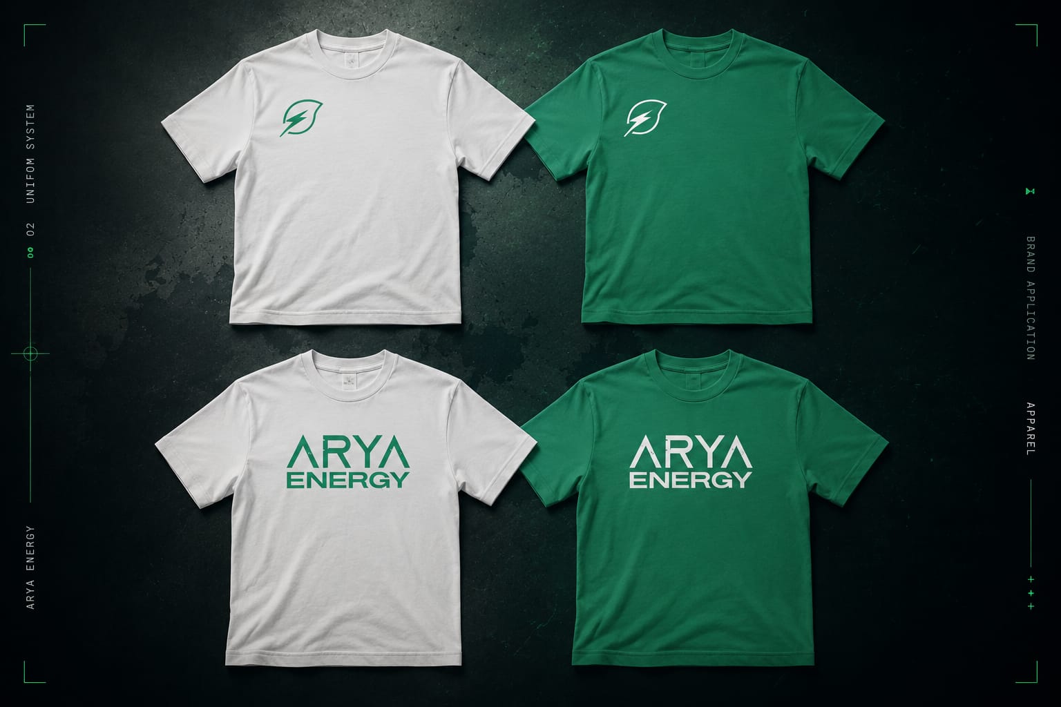
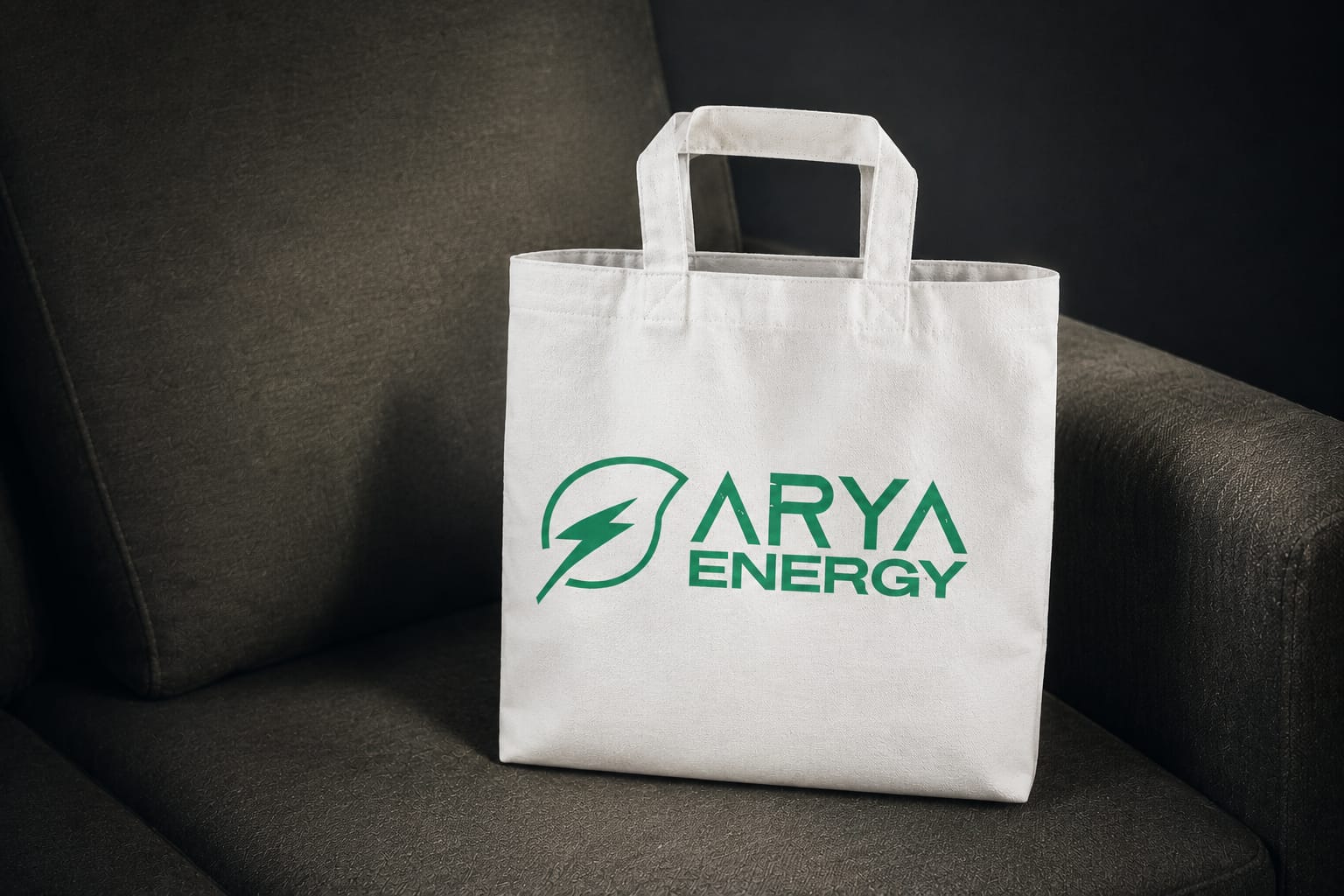
A flexible brand application system extending Arya Energy's identity across physical touchpoints — including business cards, apparel, and reusable merchandise.
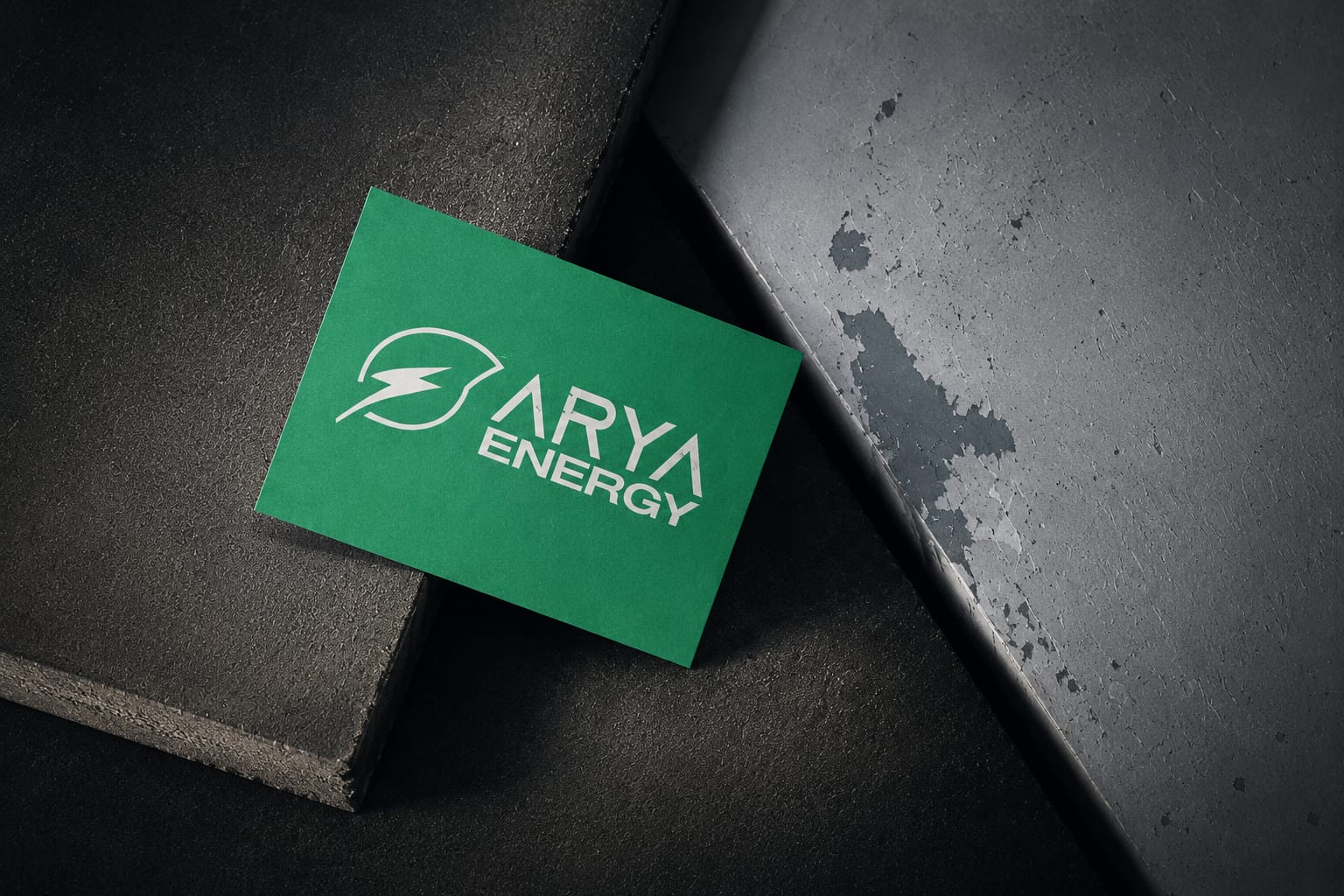
Designed as a clean, premium-first physical touchpoint for the Arya Energy brand identity system.
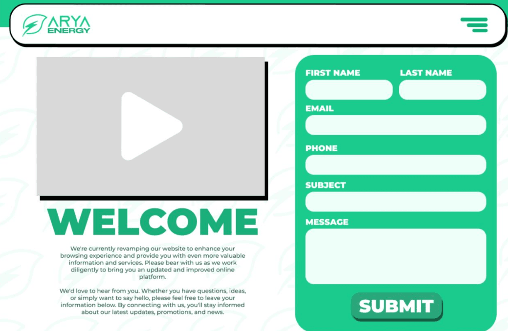
DIGITAL
INTERFACE
SYSTEM
A futuristic, contact-first surface for Arya — clean form architecture, soft shadowing, leaf motifs, and the brand's electric green pulled into interactive moments.
OUTCOME
& REFLECTION
What began as a logo became a complete energy system — a brand that can grow, charge, and renew alongside the company it represents.
"Arya taught me that a renewable brand isn't a logo with a leaf — it's a system that breathes. Every variation, every surface, recharging the same idea."