BEARCATBOOST
The commuter student's all-in-one campus ecosystem.
A centralized platform designed to connect Baruch students with resources, clubs, events, local deals and peer-driven insights, all in one place.
One platform for the
commuter generation.
Bearcat Boost is a centralized ecosystem built to solve the fragmented commuter-student experience at Baruch College, where students arrive on campus for class and leave before they ever discover what's around them.
The product unifies academic resources, social discovery, peer-driven recommendations, local food and deals, club and event discovery, and commuter support, into one calm, navigable surface. Every module is built around a single rule: a student should never have to leave the app to find what they need on campus.
Information is
everywhere.
Nothing is in one place.
Commuter students at Baruch live across a patchwork of inboxes, group chats, Reddit threads, paper flyers and disconnected campus portals. Critical opportunities, study groups, advising hours, deals, club events, get buried before they ever reach the people who need them.
The result is a campus that technically offers everything, and a student body that effectively sees almost none of it.
Five modules.
One ecosystem.
Each module is designed to stand alone, and to feed into the others, so discovery in one place compounds into engagement everywhere else.
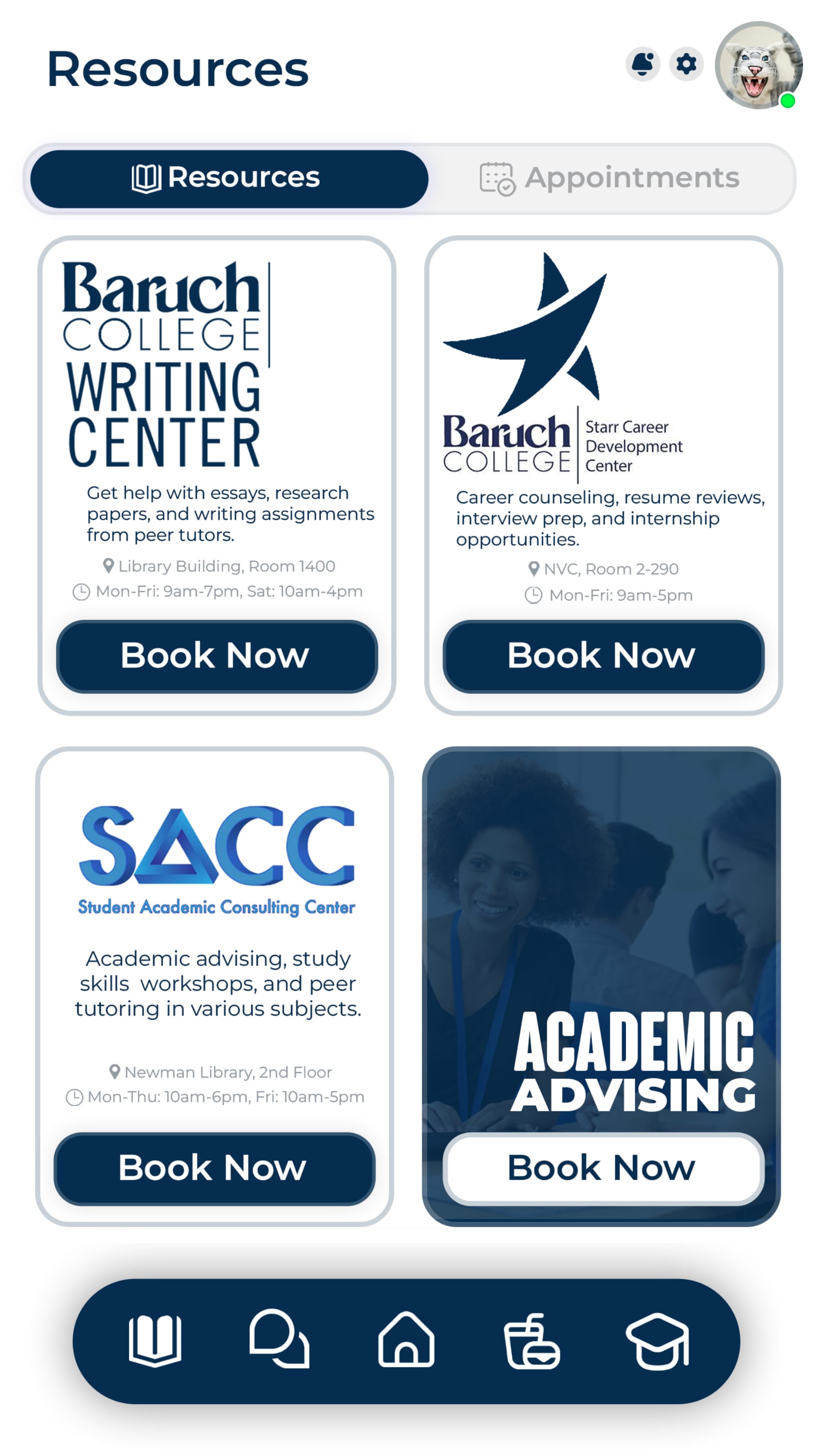
Resources
One-tap access to the Writing Center, SACC, Starr Career and academic advising, with live booking.
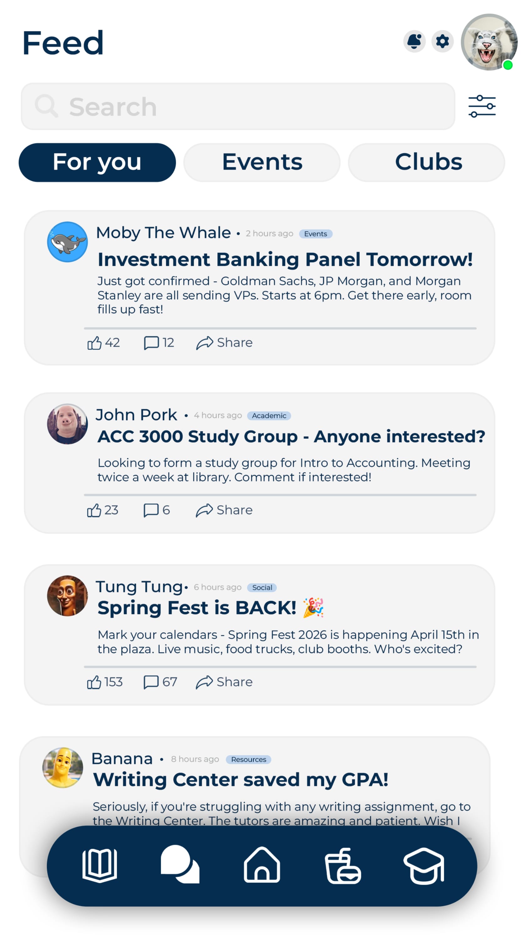
Feed
A peer-driven social layer. Study groups, event RSVPs, campus signal, sorted For You, Events, and Clubs.
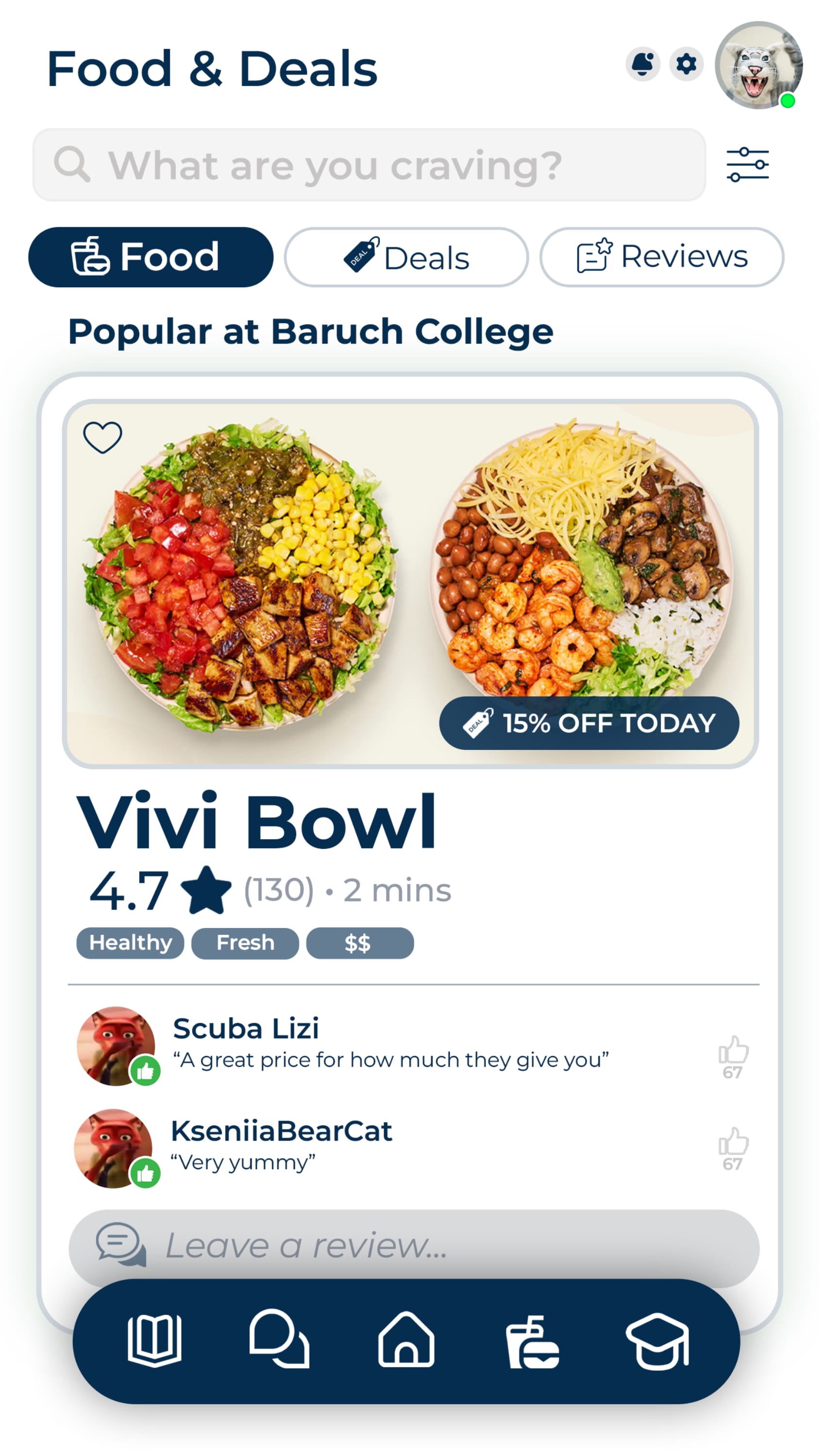
Food & Deals
Discover student-favorite spots around campus with verified peer reviews and live student discounts.
Clubs
Match with campus organizations that fit your interests, professional goals and schedule.
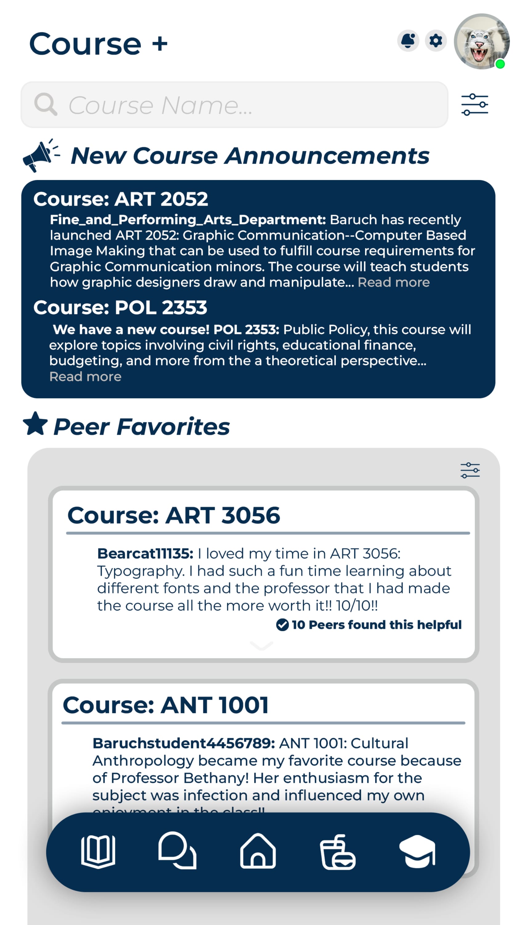
Courses+
Real peer reviews of professors, course difficulty, and announcements from the departments themselves.
A live campus,
in your pocket.
Every screen carries the same calm visual language, soft navy surfaces, cream cards, and confident rounded geometry, so moving between modules feels like rooms in the same building, not separate apps.
Home
Personalized greeting, trending feed and one-tap access to all five modules.
Feed
Peer signal sorted by For You, Events and Clubs, with rich content cards.
Resources
Live booking for the Writing Center, SACC, Starr Career and Academic Advising.
Food & Deals
Popular student spots, verified peer reviews, and exclusive in-app discounts.
Courses+
Department announcements alongside peer-verified course and professor reviews.
Designed from
the gap, outward.
We mapped where existing campus tools succeed, where they fall short, and where peer behavior on Reddit and group chats hints at the real ecosystem students wish they had.
- Centralized 5-in-1 surface
- Peer verified content
- Native campus context
- New user education
- Cold-start content
- Single-campus scope at launch
- 23K+ Baruch students
- Local merchant partnerships
- Expand to CUNY system
- Reddit / Discord inertia
- Official portals
- Generic event apps
Official portals are accurate, but cold.
Baruch's official channels deliver authoritative info, but they're spread across separate sites, require multiple logins, and rarely surface the small, time-sensitive things that matter most to commuters.
Reddit is alive, but unverified.
Forums and group chats carry the campus voice, but useful guidance is buried under memes, hard to verify, and offers no one-tap path to actually join a club, book a tutor or claim a deal.
The Commuter, first.
Designed first for the student who arrives by subway, has a 90-minute gap between classes, and wants to actually use it.
A calm,
confident language.
Soft navy surfaces, cream content cards, and rounded geometry give every screen the same sense of spaciousness, even when content density is high. Iconography stays simple, recognizable, and tappable.
Persistent floating bottom nav. The home anchor sits center-stage so students always know where home is, no matter how deep they scroll.
Build the campus
students already live in.
Bearcat Boost is, at its core, an argument that the commuter experience isn't a problem to fix at the edges, it's the actual center of modern campus life, and it deserves a product designed around it from day one.
Designing for the commuter first
Density, predictability and one-tap access matter more than novelty when your user has 12 minutes between trains.
Simplifying fragmented experiences
Replacing four logins and a flyer wall with one calm interface is, often, the entire job.
Balancing utility and community
The product had to feel both like a tool you reach for and a place you belong, without leaning too far into either.
Peer-driven engagement
Verified peer reviews and student signal turned a directory into a living, opinionated guide.
Ecosystem thinking
Every module was designed to feed the others, so engagement compounds instead of fragmenting again.